
Art Deco and De Stijl: When Jacques-Émile Ruhlmann Meets Theo van Doesburg
April 7, 2025
Margaretha Reichardt and the Introspective Modernism of Bauhaus Design
April 14, 2025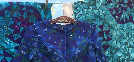
Viola Gråsten, dress and fabric in “Oomph” pattern produced by NK Textilekammare, designed 1952, purple and grey-green colors. These pieces loaned by Anna Lindqvist to the Malmö museum in May 2016.
Viola Gråsten’s flatweaves did not merely complement the Nordic room — they destabilized it. With wild color harmonies and asymmetric abstractions, she injected emotional modernism into a design language long defined by balance and modesty. What unfolded was not just a shift in aesthetic, but a cultural dissonance — one woven in wool, but felt in the bones.
In a sunlit Stockholm apartment, filtered light falls across a jagged field of magentas, ochres, and smoky teals. A Gråsten flatweave — untamed in pattern, unrepentant in color — cuts across the pale serenity of ashwood floors and clean-lined furniture. It hums, not in defiance, but in revelation.
What happens when chromatic audacity erupts in a culture built on tonal restraint? When a rug becomes a manifesto?
The Palette Before the Storm
Before Gråsten’s arrival, Swedish textile design lived in a world of softened tones and symmetrical reverence. Earthy greys, mossy greens, winter whites — a palette borrowed from stone churches, fog-draped birch forests, and the Lutheran ethic of moderation. The geometry was precise, balanced. The ethos: lagom — just enough.
This was the inheritance of Märta Måås-Fjetterström, whose pastoral romanticism and masterful weaving shaped the aesthetic backbone of 20th-century Swedish rugs. Through her and the Hemslöjd movement, textiles became quiet homages to craft and land. But they were also, at times, too obedient — rooted in nostalgia, tethered to function, reverent to symmetry. Sweden had woven itself into a corner of beautiful decorum.
A New Approach to Scandinavian Colors
Viola Gråsten arrived like a weather front. Finnish-born, trained at Konstindustriella Läroverket in Helsinki, she arrived in Sweden in 1944 — wartime exile turned cultural alchemist. By 1945, she was designing for the iconic Svenskt Tenn, and soon after, helming the textile department at Nordiska Kompaniet (NK).
Her work was explosive. Where others saw color as an accent, Gråsten wielded it as structure. Where tradition demanded symmetry, she offered swirling asymmetries and meandering forms. Her textiles — Snäckorna, Oktober, Rondeller — didn’t sit quietly within a room. They pulsated. They declared mood. They disrupted the peace.
Sweden, long a bastion of tonal clarity and woven modesty, was not ready. And yet, it couldn’t look away.
“I don’t want to decorate a room,” Gråsten is said to have mused. “I want to move it.”
(attributed in posthumous interviews, tone reimagined from her visual language)
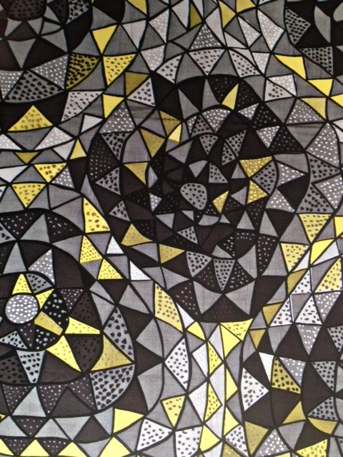
Viola Gråsten, “Oomph” pattern, printed fabric produced by NK Textilekammare, designed 1952, yellow-grey combination.
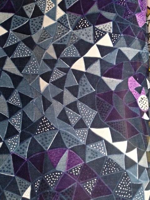
Viola Gråsten, “Oomph”pattern, printed fabric produced by NK Textilekammare, designed 1952, grey purple combination.
The Emotional Modernism of Her Rugs
Gråsten’s rebellion wasn’t just aesthetic — it was emotional. Her work belonged to a broader postwar swell that questioned the neatness of modernism. Her rugs were graphic, yes, but never cold. They pulsed with internal rhythm, often referencing nature not through pastoral depiction but through abstraction: the swell of a tide, the spiral of a shell, the fracture of ice underfoot.
What made her revolutionary?
Color as Architecture: Her palettes weren’t just expressive — they were compositional. A cobalt might anchor the entire structure; a sliver of burnt sienna might hold the visual tension.
Rhythmic Irregularity: Like jazz woven into wool, her patterns avoided repetition in favor of movement — syncopated, strange, alive.
Personal Expressiveness: In an era that praised rationality in design, Gråsten’s work felt personal, even autobiographical. Her textiles often carried an emotional intelligence that read more like memory than motif.
The Legacy
Today, Gråsten’s rugs are quietly revered by collectors and curators who understand their radical grace. Museums across Scandinavia — and further abroad — have re-elevated her oeuvre, not as a side note to Swedish design but as a rupture that redefined it.
Her legacy is felt not only in rugs but in the very color sensibility of Nordic interiors today — where boldness is no longer foreign, where abstraction no longer means coldness. In many ways, Gråsten was not ahead of her time. She simply refused to abide by it.
She stood apart even among contemporaries like Stig Lindberg or Estrid Ericson, whose playfulness and modernist flourishes rarely veered into the emotional territory Gråsten so naturally claimed. Her rugs didn’t just sit beneath your feet; they echoed in the chest.
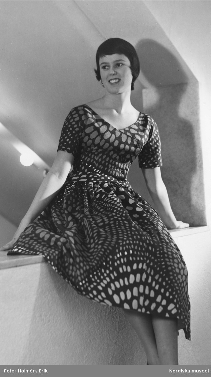
To walk across a Viola Gråsten rug is to feel history shift underfoot. It is to sense that even in the most decorous cultures, rebellion has a place — and sometimes, that rebellion is woven, wrapped in coral and petrol blue, and alive with the memory of a woman who knew that beauty needn’t be quiet to be profound.
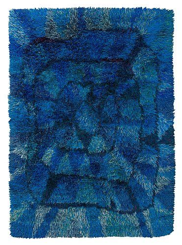
Viola Gråsten, rya rug, “Blue Moon” (Blå Mänen), for Nordiska Kompaniet Textilkammare, 252 x 177 cm (99” x 69-!/2”) sold at Bukowskis 581 Moderna Auction, 2014, item #654.
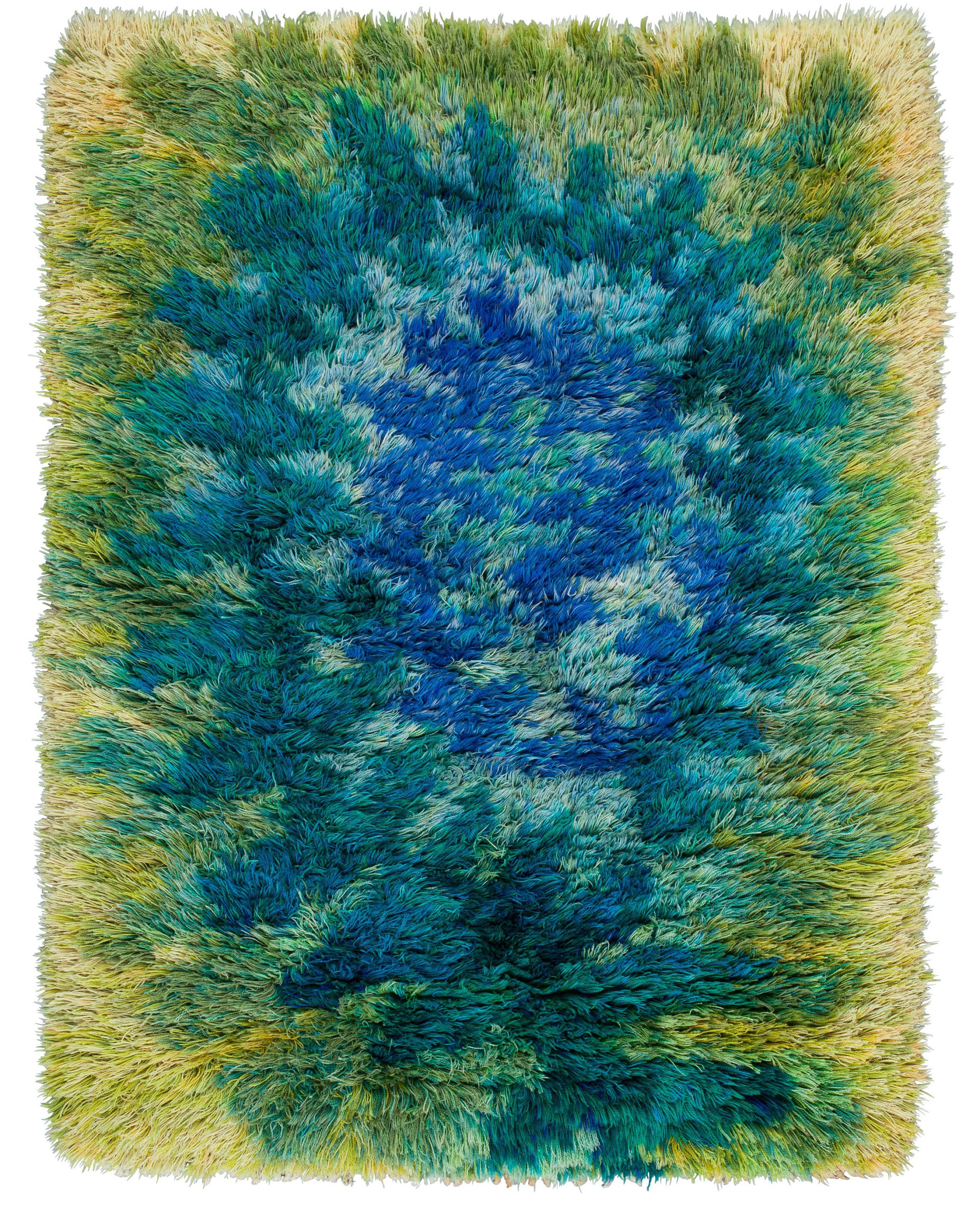
Viola Gråsten, “Fern” (Ormbunke) rya rug for Nordiska Kompaniet Textilkammare, 159 x 116 cm, with cloth label sewn on back of rug, Bukowskis Contemporary Auction 588, item 151.
~~~